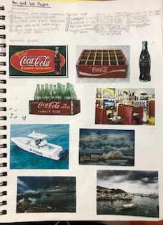
Here are my compositional sketches. I began using no color as you can see in the one to the right and then labeled where the colors would go. Next I filled them in. I used my phone to crop and rotate the pictures to find different angles and compositions.  Self Evaluation questions:
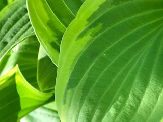
1. I think my drawing has good craftsmanship and is pretty neat and executed as accurately as I could. 2, I think I did a pretty good job using values to create depth. I tried to use darker shades to show where there were shadows or movement. I also used white to highlight high points and the variation of colors from my original pictures. 3. I tried my best to represent the artist Georgia O'keeffe and follow all the instructions. I tried getting very close to the objects I was taking pictures of which is a method that is very new to me and I have never explored before. 4. I used different shades of purple to show the graduation on the petals. I also mixed colors and one thing I found interesting was how the flower contained both yellow and purple which are complimentary colors. 5. I created contrast using different shades and tints of colors and used a lot of black to show empty space. 6. I used texture on the petals with the veins and highlights on the parts of the petals that were white or a lighter purple. 7. I had lots of difficulties trying to find the right colors to match the picture and also trying to make it look 3D and as realistic as possible. Brainstorming and references
compositional sketches final sketch with pen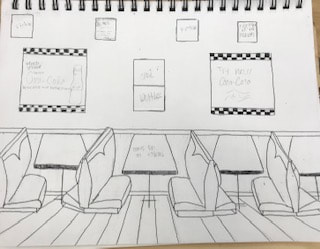 progress pictures
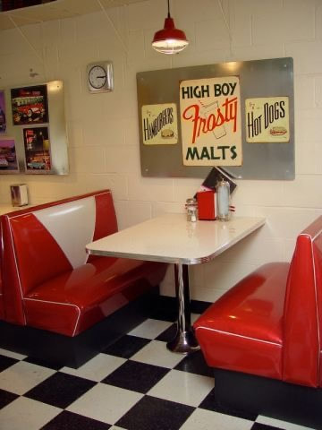
final artwork Drafting questions1. For my pen and ink techniques I began by looking up wood grain to see how to try and make a hard wood type of floor. I used this to create the pattern and then used stippling under the table to create a shadow. Then I used hatching on the seats to create value and a light source/reflection
2. I used perspective to create dimension and the illusion of space 3. Texture is important in my composition because it creates a mood and shows where the light reflects for example on the cushions on the seats. Texture is all used in the flooring to make a wood type of pattern 4. Value in important in this project to produce depth and also creates a light source and how dark or light and object is. 5. Technically my craftsmanship could have been better. Towards the end I had to work at home so I didn't have the right type of pen which lead to some technical difficulties in making more precise lines. 6. If I recreated this piece I would add more seats or stools with tables and try to incorporate more coca-cola bottles into the image 7. It is important to make sure you understand the concepts taught in class so you can apply them to your project and use resources like the pen and ink value and texture videos to your advantage to learn from them 8. I think I learned how to find a vanishing point, to make sure you have all the necessary and correct materials, to do lots of research to find references for inspiration and to always practice or brainstorm before hand. These are not steps I would have taken before this project. Here are my 4 assessment drawings. The prompts were to draw a shoe with laces, a hand, a portrait of a friend or a friend and a 2 point perspective. For the show with laces I drew the air forces ones I was wearing that day. The most challenging part of this drawing was trying t achieve detention with shading and the bottom of the shoe because it had such small details. Next Id new the portraits. I tried to just make up a face which was very difficult and I was not happy with how it went to I restarted with a picture of my boyfriend and drew him instead which I was much happier with. Now I drew the two point perspective. I had never done this before so I looked up examples and tried my best by creating a small city street corner with some shops and signs. Lastly I drew the hand which I modeled after my own. This was very difficult to get the shading and veins. PERSPECTIVEHere are my 4 assessment drawings. The prompts were to draw a shoe with laces, a hand, a portrait of a friend or a friend and a 2 point perspective. For the show with laces I drew the air forces ones I was wearing that day. The most challenging part of this drawing was trying t achieve detention with shading and the bottom of the shoe because it had such small details. Next Id new the portraits. I tried to just make up a face which was very difficult and I was not happy with how it went to I restarted with a picture of my boyfriend and drew him instead which I was much happier with. Now I drew the two point perspective. I had never done this before so I looked up examples and tried my best by creating a small city street corner with some shops and signs. Lastly I drew the hand which I modeled after my own. This was very difficult to get the shading and veins. Value chart and shapes with pencilThis is my pencil value chart and drawing shapes and forms using value. We were assigned to make a value chart using pencil which was fun but difficult because we couldn't smudge ut and were supposed to just apply more or less pressure on the pencil to achieve the shades. Then we drew the forms on our table and used value to create thee shadows and make a light source on them. Next we dew the items sitting on our table. I drew a small paint bottle and a larger paint tube using shading and value to add dimension. Lego drawingFor this activity we created a lego structure with our group and took pictures from all angles. Next picked one of the pictures and sketched it to scale using perspective. This was hard to find what perspective the image was in but the sketch overall was easy. Pen and ink value Chart and tutorialsFor this task we were first told to create 4 value charts and label them. We made a value chart using stippling, hatching, cross hatching, and invented. Next we watched 4 pen and ink value tutorials that taught how to make texture and value using different methods with pen and ink.
|