|
This is a drawing I did in orange pen on the first week of Art 1. The challenge was to look at the image that was rotated upside down and draw it. This is my favorite piece of art I have done so far in this class because although drawing the picture upside down was difficult, I really enjoyed this method. I think this turned out pretty good except I made the man's hands a little too big. Overall, I really enjoyed this warm-up.  This was a drawing made in pencil of a cardboard paper towel roll. I focused on using shading to get dimension and trying to get the circular ends of the roll as accurate as possible. This warm-up was a little challenging especially trying to get all the little lines and details you would usually overlook and figuring out how to capture your perspective. I think this drawing also turned out good and I feel like I improved after this warm-up.  This was also a very challenging warm-up. Pur directions were to use marker to draw a lego block without look at out paper or picking up our marker. This is not my best looking art but I thought it was very fun and it pushed you because you had to resist looking at your paper to check your work or lifting your marker to make a new line. I really enjoyed this warm-up and although it did not end up looking the best, it was an interesting method.  This is a collage I made the 4th week of Art 1. My idea behind this was showing how we may soon lose our home (Earth) and look for new planets or places like the moon to inhibit. For this project I found an image of Pluto in a National Geographic magazine and used that as my background image to tie the whole collage together. I found pictures of a young family in astronaut suits and rocket and layered h20 containers. I found an old image from the 1950s of another family throwing away all their trash and cut out some trays and other pieces of garbage to put around the picture. In other magazines I found the words "Project" (from a Project Runway ad), "new home", and "rebuild". I found these words fitting because of it ever comes to the point where humans must move their life into outer space, we will need to rebuild everything so we can sustain human life. I put the words "Project" and "new home" together because I believe Project New Home would be a good name for the mission to move humans to space. A challenge I had with this project was trying to find images that fit the space vibe and weren't too large. Overall, I really liked this project and I am proud of my work.  Art 1 week 5-8This is a drawing I made for the first day of Inktober. The prompt for day 1 was ring so I decided to draw a ring pop. This was a little bit challenging because I didn't use color to I had to mimic the blue and pink on the ring pop by drawing darker and lighter. I started this drawing by using pencil to get the original shape right and then went over in pen. One thing I wish I had done better with this was the bottom part of the Ringpop where you hold it. I think I could have done better making it look realistic and 3D.  This is my work from day 8 of Inktober, The prompt for this day was frail so I made a heart. Once again, I started by doing the outline with pencil. Next I went over the pencil with a black pen and then added veins and creases for dimension with it. Next I wet my brush and added a very small amount of of ink to it. I filled in the heart with this and by watering down the ink I was able to make it look gray. Once I finished I decided to use the same water and ink method to create the border type lines around the heart which now looking back I wish I had not done that because it looks a little messy. I really like this and I think I did a good job of using new methods and experimenting.  This is a butterfly I made using acrylic paint and ink. I used red, purple, and white to create the pink color on the wings and then black ink to make the thick lines on wings and outline them. I used white paint to make small dots on the wings that I saw in the images I had used for inspiration. For the backdrop I mixed dark blue, purple, and a small amount of green to get the color. Overall, I don't really like this painting and I wish I had been more precise with my sketch so the end result would have turned out better. I think I also could have chose a better color for the background that would compliment the pink well.  This is a drawing I made completely out of pen for day 2 of Inktober. The prompt was mindless so I drew a little boy watching tv. This shows the idea of how technology is taking over our society because the boy is staring at blank static on the television. In the corners of the tv you can see words like "help" which is supposed to show the young boys thoughts and how technology is taking over. One thing I wish I had done better with this was the teddy bear in the boys arms. I used small dots to try and replicate the fur on the teddy bear but it just made it harder to tell what the boy was holding.  Here is a drawing I made in ink for day three of Inktober. The prompt for this day was bait so I got inspiration from Pinterest to draw a hook. I used the same shape and some aspects from the image online but created my own pattern for the inside design of the hook. One thing I wish I had done better with this was making the small details more exact and the small lines on the outside of the hook more exact so it wouldn't look so messy. Overall, I really enjoy this drawing and I am proud of it.   Here is a drawing I made of a city street corner. I chose this project so I could experiment with using perspective. I began the process by searching "city street corner" and chose the first one that caught my eye. I was particularly drawn to the image I chose for inspiration because of the shapes at the top of the buildings. I started by measuring to see how large I needed to sketch out the buildings to be. First I made the outline of the middle building and then I filled in the inside of the building with windows, posters, signs, etc... Next I worked on the other two buildings following the same process of working from the outside first and moving in to work on the smaller details later. Lastly I colored the buildings. I chose not to include the cars or citizens that were in the original picture and even changed the names of the stores and colors of the buildings. The tools I used for this were pencils, erasers, pens, and markers. Some of the techniques I used were perspective (2 point perspective) and directional lines and repetition. The directional lines showed the direction of the building and signs/windows while repetition was shown in the windows architecture. I also used space and dimension to show how close the buildings were to each other and bring depth into the image that was lost in the middle building since it is forward facing.     Here are some photos of my watercolor process. I began by painting a solar system just for fun and to get some practice. Then I moved on to the toucan project. I started with a rough sketch of the general shape I wanted for it and then did a practice to see where I wanted to place certain colors. I used the reeves watercolor paint and small brushed to fill in the smaller spaces. For the darker parts of the body I used black, blue, and dark blue paint and for the purple I mixed red with both blues. My favorite part of this is the gradient on the stomach because I really like how the yellow fades to orange. The biggest challenge was the black bleeding into the colors on the beak from using too much water. I used movement because your eye travels from the most colorful and vibrant parts of the painting to the darker and less intriguing areas. Through this process I learned how to experiment with mixing colors and use different amounts of water to have different effects on how pigmented the colors appear or how the paper reacts.
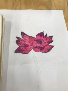
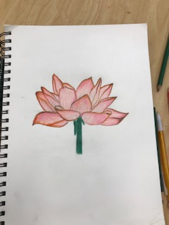
The lotus flower on the left is the art I made on the first day of class and the one on the right is the one I remade this week. On the first flower I began by looking up images for inspiration and to get the general shape of the flower. I used pencil to sketch it and colored pens to color it in. I started coloring by using a darker purple-ish pink color for the darker shaded parts of the petals. Next I used a bright pink to fill in the bottom of the petals and then I made small blue dots to add some color. On the second flower I used colored pencils. the process started the same where I used the image and sketched out the shape. Next I used white to fill in the petals and then a red-ish/pink/orange color for the darker parts of the petals. Then I went in with a very light pink to fill them in. Lastly I colored the stem using a mix of greens. For this project I think I improved in my use of materials and getting the shape of the flower more accurate. I am much happier with the second flower and I think it shows a lot of growth from the beginning of this semester. I went out of the comfort zone and used a new material I hadn't really experimented much with and I think that shows I am more confident in my artistic ability and creativity.  Here is some drawing I did just for fun. The idea behind this was to draw a character from a Disney movie for each year from 2000-2010. I have them labeled with the year each was released and the movie title. This project was a lot of fun because I got to go on a journey through my childhood and remember some of my favorite movies from when I was young. I was hoping to get to draw characters from 2011-2020 but I unfortunately didn't get that far. I had seen ideas like this online where people made videos of their favorite childhood tv shows and movies so I used this as inspiration and turned it into an art idea. I am overall very proud of this and although some of the pictures aren't as good as I would have hoped, I am happy I got to do something fun like this.
0 Comments
|